
Tech
Australia’s beloved weather website got a makeover and infuriated users
Sydney was already bracing for an unusually warm spring day on 22 October with a forecast of 39C, a temperature more typical of mid summer than early spring. Only a day earlier, New South Wales recorded its hottest day in more than a hundred years when the outback town of Bourke reached 44.8C. But while Australians were focused on the weather, another storm was brewing, this time aimed directly at the Bureau of Meteorology. Known affectionately as the Bom, the agency launched its long awaited website redesign that same morning, a significant update after more than ten years. Instead of being welcomed, the change sparked immediate and widespread frustration.
A redesign that triggered national complaints
Within hours of the new website going live, the Bom was overwhelmed with complaints from frustrated users. The hashtag changeitback quickly began trending as people voiced their dissatisfaction on social media. Many explained that the redesign made essential information harder to access and changed features that long time users relied on. The most contentious update was the new colour scheme for the rain radar, which many said made it difficult to interpret weather patterns. For thousands of Australians who check this data daily, especially those living in areas prone to storms or floods, clarity is not just convenient but essential.
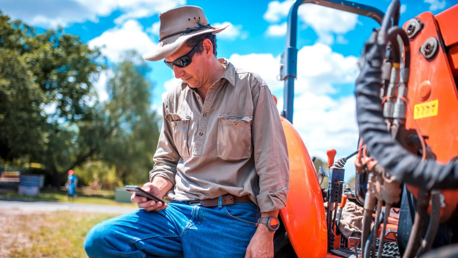
Frustration from farmers, fishers and regional communities
Some of the strongest criticism came from farmers and fishers who depend heavily on accurate and detailed forecasts. The new layout removed a popular function that allowed people to enter GPS coordinates to view precise local forecasts. For those working in remote areas, this feature was crucial. Without it, they said they could no longer plan work, travel or safety measures with the same confidence. Many argued that the redesign seemed to prioritise aesthetic changes over practical needs and risked overlooking groups who rely on the Bom’s services for daily decision making.
The cost revelation that intensified public anger
Just as the public was adjusting to the new design, news emerged that the website overhaul cost far more than previously stated. Initial figures suggested the upgrade would cost around A$4.1m, but reports this week revealed the true cost was closer to A$96.5m. The revelation shocked and angered users who were already unhappy with the site’s functionality. Many questioned how such a large sum could be spent on a redesign that appeared to make the service less user friendly. The controversy quickly turned into a broader debate about government spending and management of large scale IT projects.
Experts explain why users reacted so strongly
Psychologist and neuroscientist Joel Pearson said the backlash stemmed from a combination of unmet expectations and perceived waste. He explained that people react strongly when something familiar becomes more difficult to use, especially when the change affects daily routines. Learning that the redesign cost far more than expected only deepened frustration. He compared it to hiring a team to renovate a house, discovering that the renovation made the home less functional and then finding out the bill was large enough to cover the cost of a luxury property. The sense of disappointment and disbelief amplifies emotional responses.
A lesson in design, communication and public trust
The Bom now faces the challenge of rebuilding trust with users and addressing the concerns raised. Many Australians rely on the agency’s forecasts for safety, work and travel, making usability an essential part of its public service. The situation highlights the importance of strong communication, thoughtful design and careful consideration of user needs when updating essential national platforms. As the Bom evaluates feedback and considers future adjustments, the agency’s experience serves as a reminder that even well intentioned improvements can provoke backlash if they disrupt routines or fail to meet expectations.